When to use aria-labels in your HTML
TL;DR
It's common to display multiple links with the same text on a web page — such as 'read more' in a list of blog posts. To improve the web page experience for people who use screen readers and accessibility tools, add an aria-label to the anchor element with text that differentiates the content of the onward links.
Check the results in Chromium Dev Tools > Accessibility. Voila!
Checking for accessibility
In a previous post, How to make your code blocks accessible on your website, I listed many of the tools I use to check accessibility on my websites as part of my workflow, including axe Dev Tools.
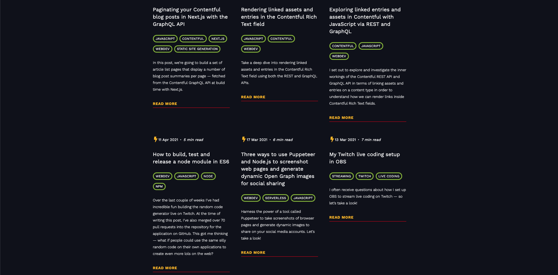
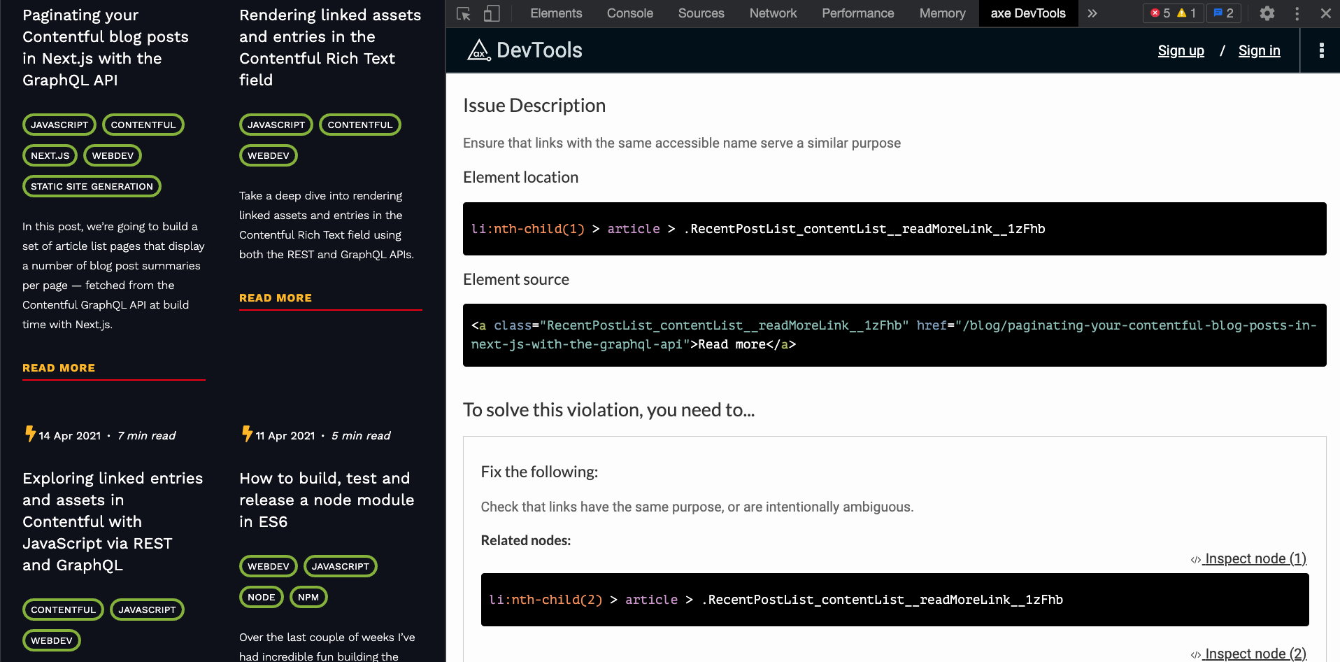
Here's a section of my website home page that displays a list of recent blog posts. Observe six links with the text 'read more', below.
The code for each 'read more' link (without an aria-label) might look like this:

<a href="https://whitep4nth3r.com/blog/how-to-make-your-code-blocks-accessible-on-your-website">Read more</a>If we scan the code above with axe, we receive the following warning:
Ensure that links with the same accessible name serve a similar purpose
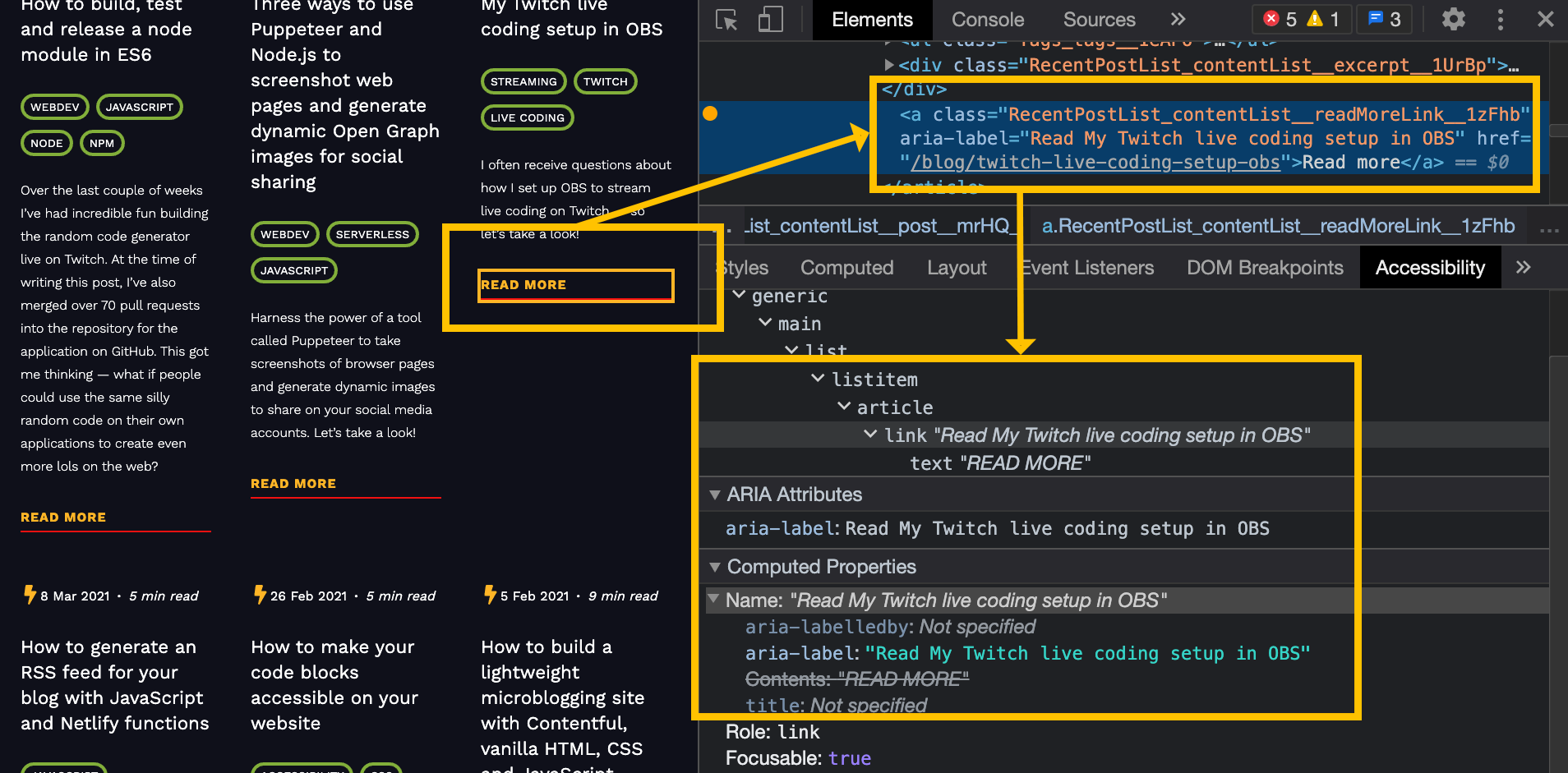
You can use the accessibility tree in Chromium Dev Tools to check how screen readers and assistive technologies understand your web page. Find the accessibility tab far to the right of the styles tab.
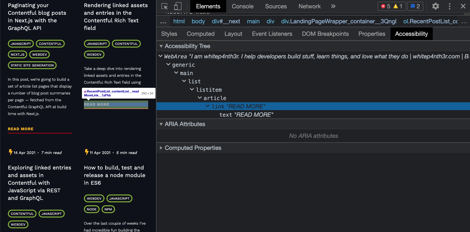
If you were using a screen reader to select the link to a specific blog post, and all the information you had was the text 'read more' — six times over — you'd be pretty frustrated! So how do we fix it?
Add aria-labels to provide descriptive information
I always recommend using a variety of tools to check accessibility on your website, and also to use your judgement. Here's what Axe suggests to check in the above example:
Check that links have the same purpose, or are intentionally ambiguous
I checked, and I confirmed. These links do not have the same purpose — they link to different blog posts or onward journeys. Here's where the power of aria-labels comes into play.
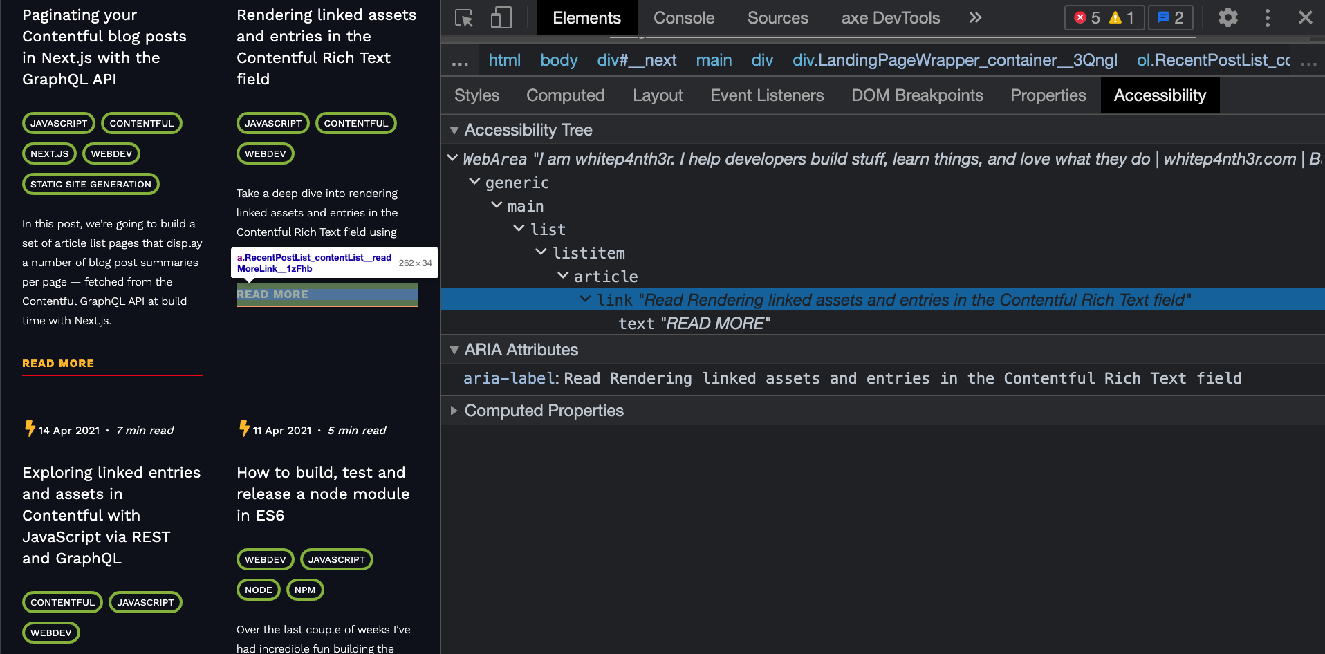
Here's the same anchor link with an aria-label attribute added:

<a href="https://whitep4nth3r.com/blog/how-to-make-your-code-blocks-accessible-on-your-website" aria-label="Read How to make your code blocks accessible on your website">Read more</a>When we re-scan the page with axe with the aria-labels in place, everything looks good! We also see that the links have distinct titles in the accessibility tree, allowing screen readers and assistive technologies to read out a more descriptive link when the element is in focus.
The edge case
The downside to relying on aria-label is that the content of the attribute may not automatically be translated when using automatic translation tools. Adrian Roselli tells us more in this blog post — aria-label Does Not Translate.
7 web dev accessibility tools to help you build better websites
To learn more about the different accessibility tools I use on a daily basis, check out my very first YouTube video — 7 web dev accessibility tools to help you build better websites.
Make accessibility part of your web dev workflow from the moment you write that first line of code, and you'll automatically create better and more inclusive experiences for everyone as you build stuff, learn things, and love what you do.
