How to make your font sizes accessible with CSS
Everyone has personal preferences when it comes to browsing the web. Light mode, dark mode, window size and zoom percentage are only a few ways in which folks can optimise the quality of their reading experience — whether they are visually impaired or not. For example, when I live stream on Twitch, I increase the zoom value in browser pages and browser dev tools to ensure that my viewers can see what I'm explaining clearly — especially if they're viewing the stream on a mobile device.
Fun fact — I'm writing this blog post in the Contentful Web App zoomed in to 110%.
Ensuring that people who use your website can override text spacing without affecting the readability of the content, is one of the most positive impacts you can have on the quality of a person's reading experience. Guidance on text spacing from W3C Web Accessibility Initiative (WAI) states the following:
...ensure that people can override author specified text spacing to improve their reading experience
...ensuring users can override author settings for spacing also significantly increases the likelihood other style preferences can be set by the user. For example, a user may need to change to a wider font family than the author has set in order to effectively read text.
At the time of writing this blog post, I attempted to find data on the percentage of people who browse the web at the non-default font size settings — and I concluded that the statistics aren't important. What's more important is that as web developers, we consider people's personal preferences and needs — and build applications that respect those needs.
Setting the preferred browser font size
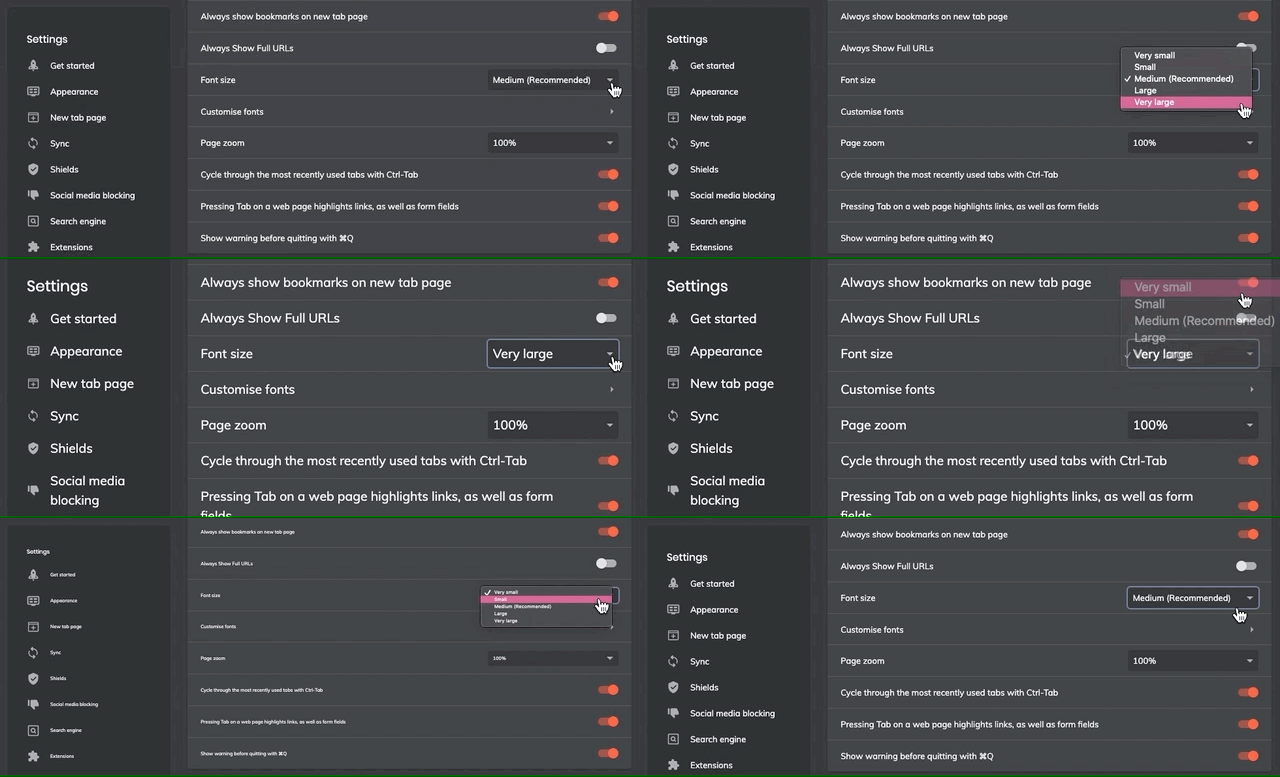
Browser font size settings are usually configured in browser settings > appearance settings. In Brave browser (Chromium-based), you can find the browser font settings in settings > appearance > font size.

Now we know how to change font size settings to check how our websites respond to user-specified settings, let's take a look at two CSS rules we can use to ensure a website responds to those settings.
Set font-size: 100% on the html tag
Setting font-size: 100% on the <html> tag ensures that your CSS applies an initial font-size value to the whole document that is equal to the font size set by the user in the browser. More on why this is important later.

html {
  font-size: 100%
}
Use rem units for font sizes
A rem unit in CSS stands for root em.
An em unit is equal to the computed value of the property of the parent element on which it is used. For example:

.parent {
  font-size: 16px;
}

// 1em = 16px, inherited from the parent element

.parent .child {
  font-size: 1em;
}

// 2em = 32px, inherited from the parent element

.parent .anotherChild {
  font-size: 2em;
}
A rem unit is calculated relatively to the computed value on the root element (this bit is super important), which is usually the <html> element. For example:

html {
  font-size: 16px;
}

// 1rem is equal to the font-size specified on the html root element
// In this case, it is calculated at 16px

.anyOtherElement {
  font-size: 1rem;
}

// The computed value of 2rem is 32px

.anotherElement {
  font-size: 2rem;
}
If we modify the example above to use font-size: 100% on the root (<html>) element, we automatically set the initial font size of the document to 100% of the size specified in the browser — this is the computed value — and all child elements that use rems as a unit of measurement will be calculated relative to the computed value.

// Set font-size: 100% on the root element to pick up the browser setting

html {
  font-size: 100%;
}

// 1rem = 1 x the default font-size set by the user in the browser

.anElement {
  font-size: 1rem;
}

// 2rem = 2 x the default font-size set by the user in the browser

.anElement {
  font-size: 2rem;
}

// and so on...
Watch it in action
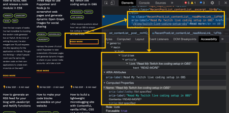
Inspect the DOM on whitep4nth3r.com for a live example of how using font-size: 100% on the <html> element and rem units for all font-size declarations (and more) allows the web page content to respond to browser appearance settings.

And there you have it — two CSS rules to live by to ensure people who use your website can override text spacing without affecting the readability of the content as specified by the W3C WAI Guidelines.

