Your background images might be causing CLS
Cumulative Layout Shift (CLS) is where the layout of a web page unexpectedly shifts after the initial content loads and new content pops in. At its best, it’s a little inconvenient. At its worst, it’s an accidental click of a “BUY NOW” button that suddenly appeared under your mouse cursor after an ad loaded, resulting in an unwanted purchase.
CLS is one of the Core Web Vitals that your pages are scored (and ranked) on by Google. It’s often caused by client-side data-fetching after a page has first loaded, and loading large images, ads or embedded media players, all of which are made worse by slow internet connections. The purpose of using CLS as an indicator of performance is to ensure that we’re building great user experiences, and not causing users to accidentally perform actions they did not intend. Not all CLS is bad, however. Google states that “In fact, many dynamic web applications frequently change the start position of elements on the page. A layout shift is only bad if the user isn’t expecting it.”
How is CLS measured?
CLS is measured on a decimal scale. A good cumulative layout shift score is 0.1 or less. A poor CLS score is greater than 0.25. Similar to how Interaction to Next Paint (INP) is measured, Google assesses your page for CLS based on the largest burst of unexpected layout shifts that occur during a user’s time on the page. Smaller one-off instances of layout shift may be inconsequential, but a bunch of layout shifts happening one after the other, i.e. cumulatively, is what we need to avoid.
How to avoid unexpected cumulative layout shift
There are tried-and-tested ways to avoid causing CLS on your web pages, including but not limited to:
Include
widthandheightattributes on image elements and iframes.Provide placeholder elements (sometimes known as skeleton loaders) that are the same dimensions as dynamic elements that may be loaded via JavaScript later in the page life-cycle.
Use the CSS at-rule
@font-face: size-adjustto minimize any shifts caused by font files loading after the initial page render. Lazar Nikolov takes a deep dive into this topic in his article: Web Fonts and the Dreaded Cumulative Layout Shift.
This post is not intended to be a complete guide to preventing CLS, but to highlight an edge case you might not be aware of. If you’re interested, however, Barry Pollard writes in depth about how to fix CLS issues in Smashing Magazine.
How to check for CLS during development
You can use the Performance tab in Chromium browsers (such as Edge, Brave, Chrome and Arc) to identify layout shifts and their associated scores. You may want to simulate slower internet connectivity and slower machines by enabling CPU and network throttling, depending on the target audience of your website.
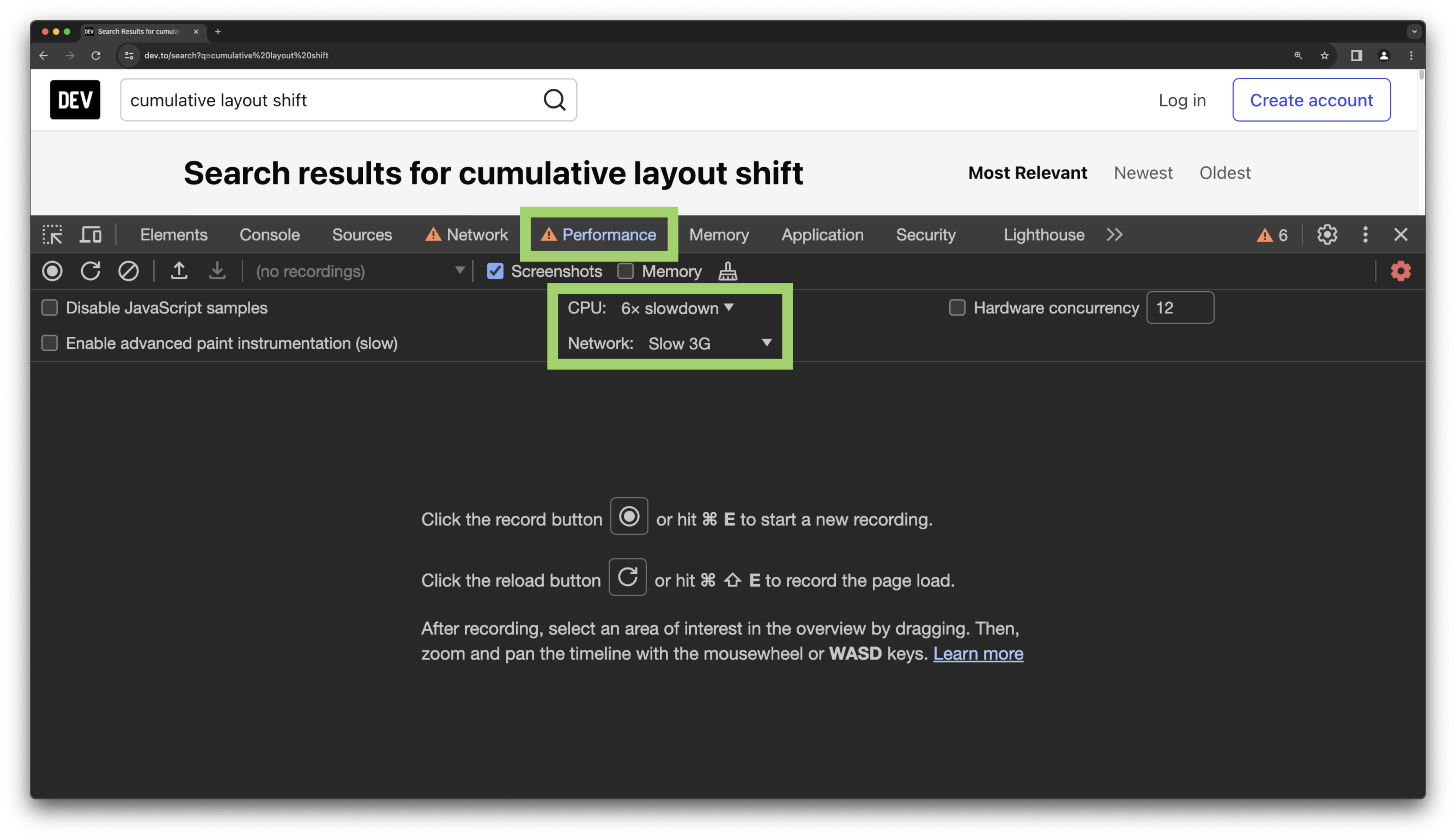
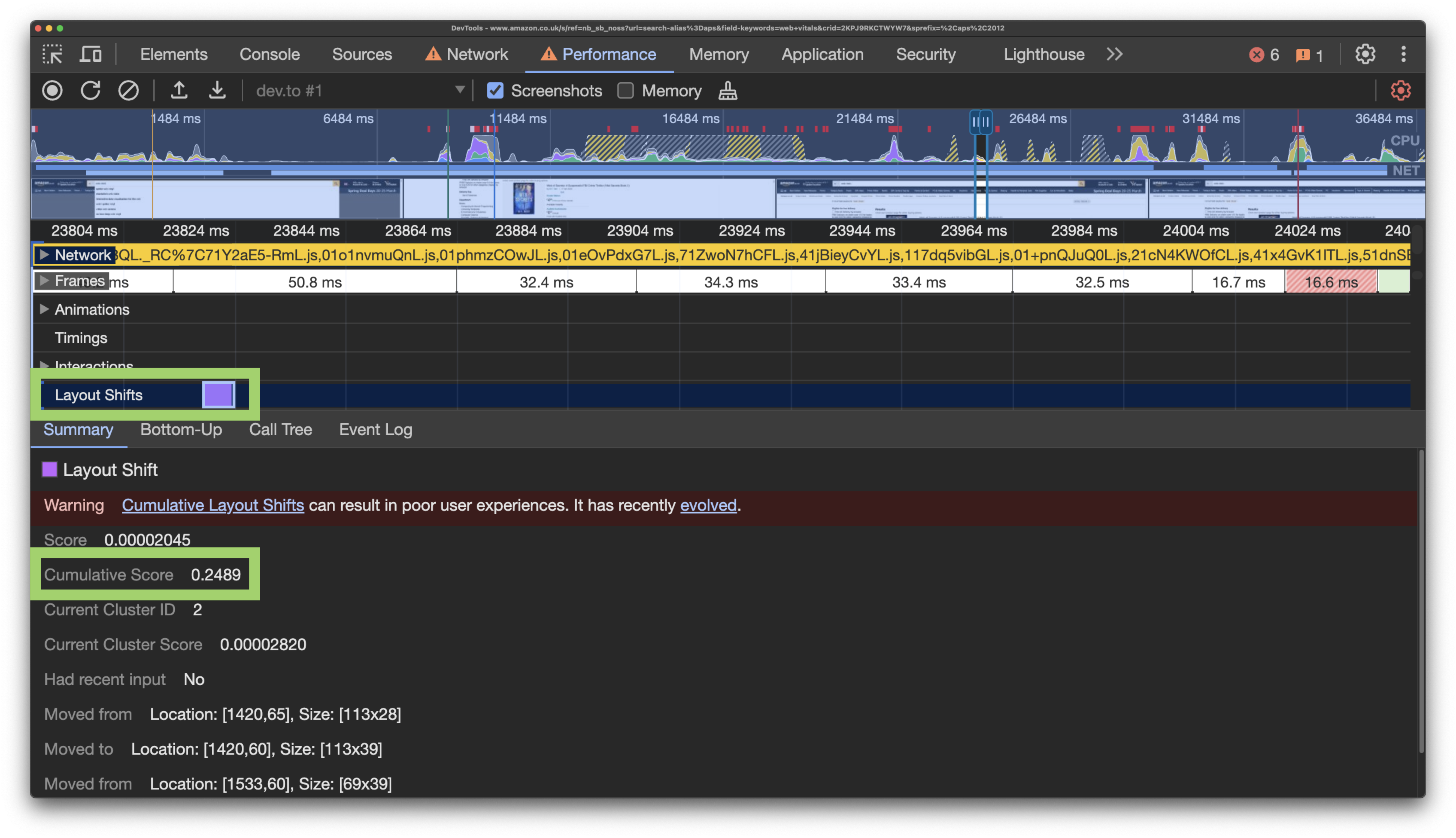
Click the reload button to record the page load and wait for the profile to generate. If any layout shifts happen, you’ll see a Layout Shifts lane. Zoom in and click on a layout shift event, which will open up a summary tab below with additional details, including the cumulative score for that event.
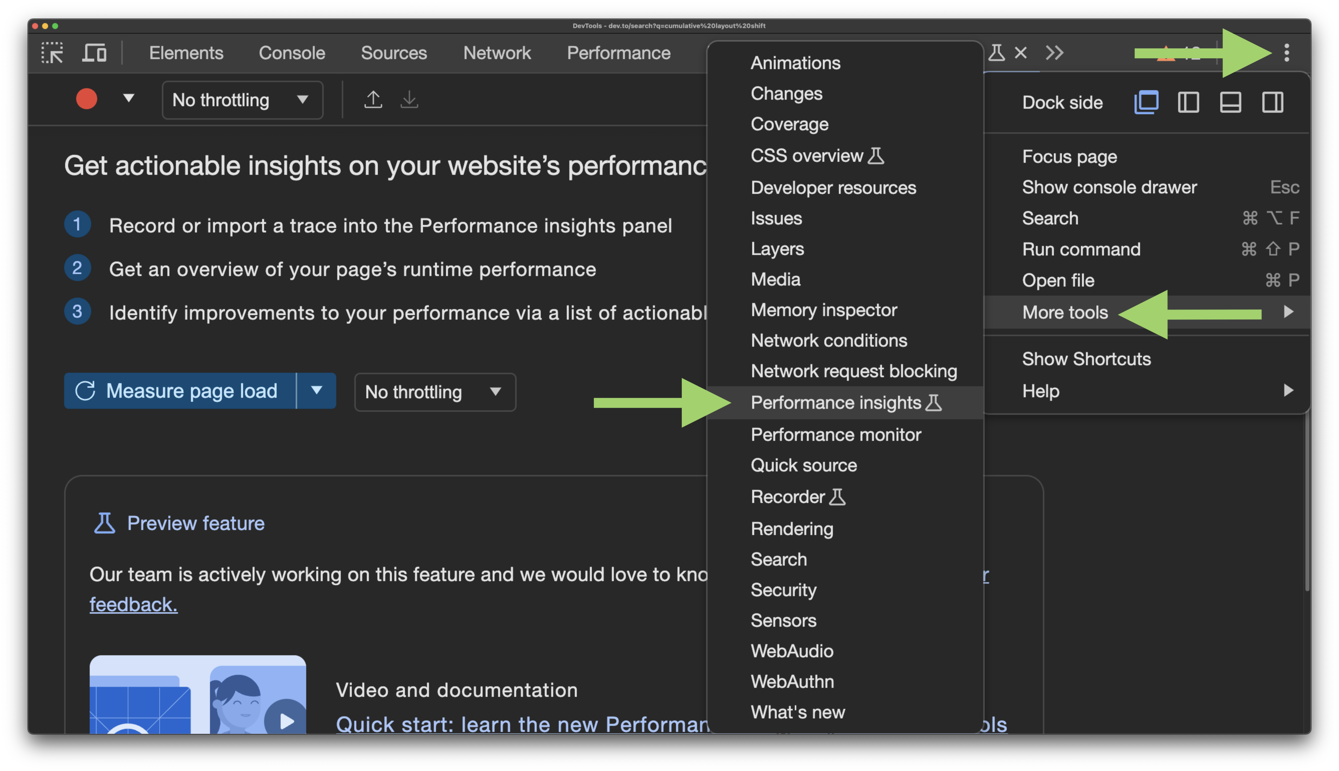
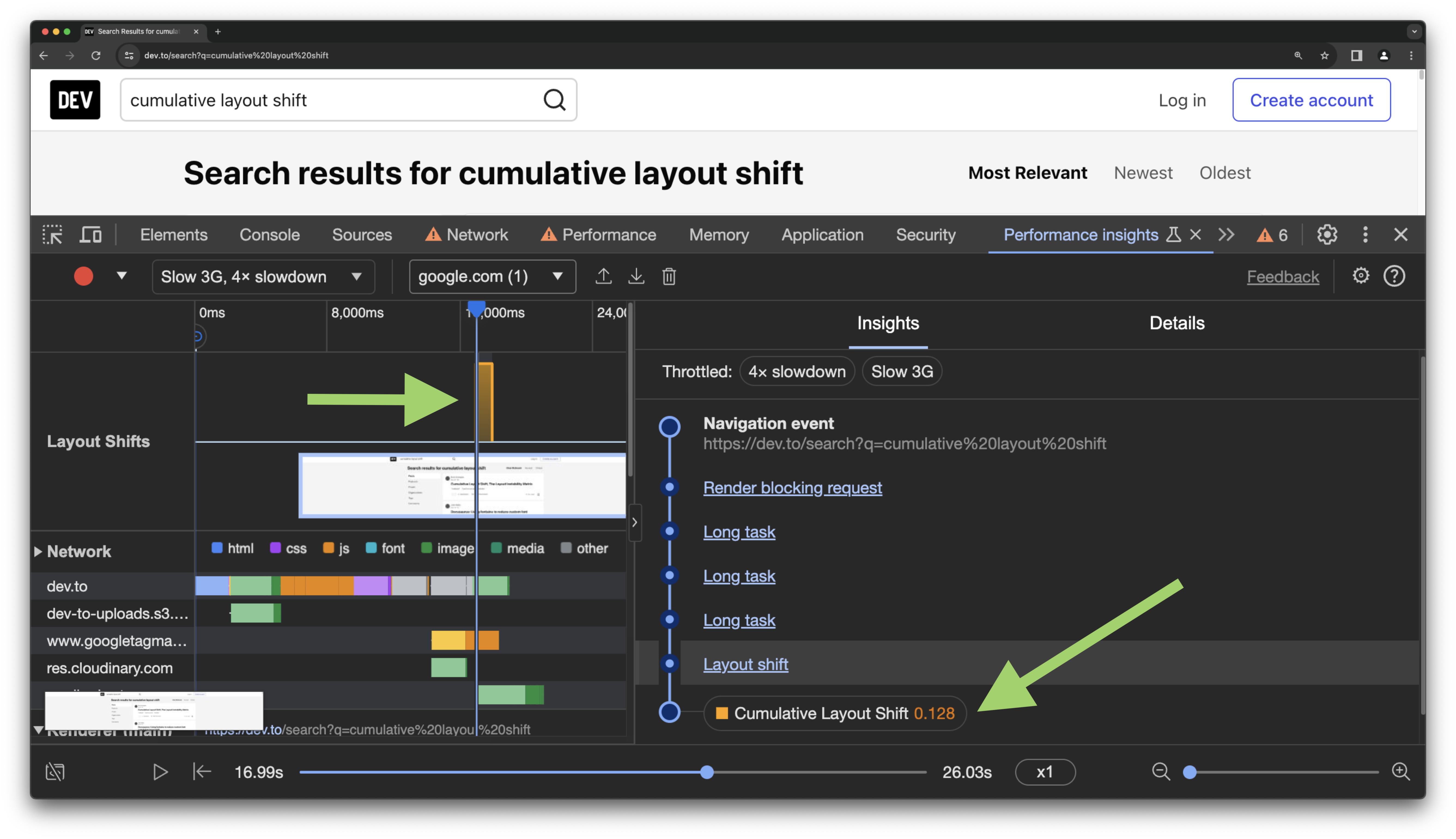
Additionally, a new and experimental tool in Chrome browsers called “Performance Insights” helps you identify layout shifts a lot quicker. To enable this tool, click on the three dot menu to the top right of dev tools, hover over “More tools” and click on “Performance insights”.
With the Performance Insights tab selected in dev tools, click the “Measure page load” button. This will refresh the page and record what happens on load. On the insights panel to the right, you’ll see any registered CLS with an associated score. Click the event to inspect more details about it, including the source of the layout shift in the HTML.
CLS is not just for foreground elements
Now, let’s get to what we’re really here for. We usually talk about CLS disrupting the user experience by unexpectedly shifting content on a page that a user might interact with. As a result, I always figured CLS was calculated based on content shifting in the foreground only, i.e. interactive UI elements that are part of the actual user experience.
However, I recently discovered that CLS is calculated for all page elements, including elements in the background that may not actually shift UI elements for the user. This makes perfect sense, actually. The CLS calculator can’t really be intelligent enough to take into account the z-index of a page element.
How did I discover this? Sentry found it for me on my website.
How to discover CLS in production for your real users
Whilst checking for CLS in development is good practice, nothing beats analyzing real data captured from real users interacting with your websites. I recently started using Sentry to monitor the performance and Core Web Vitals for my personal website.
I have configured Sentry Performance to capture information for 50% of my traffic. For each captured event (or transaction), Sentry sends a number of associated tags which can include sources of CLS if relevant. What’s really helpful is that Sentry also includes the HTML elements that point to the source of the CLS, so you know exactly where in your code to look to fix it.
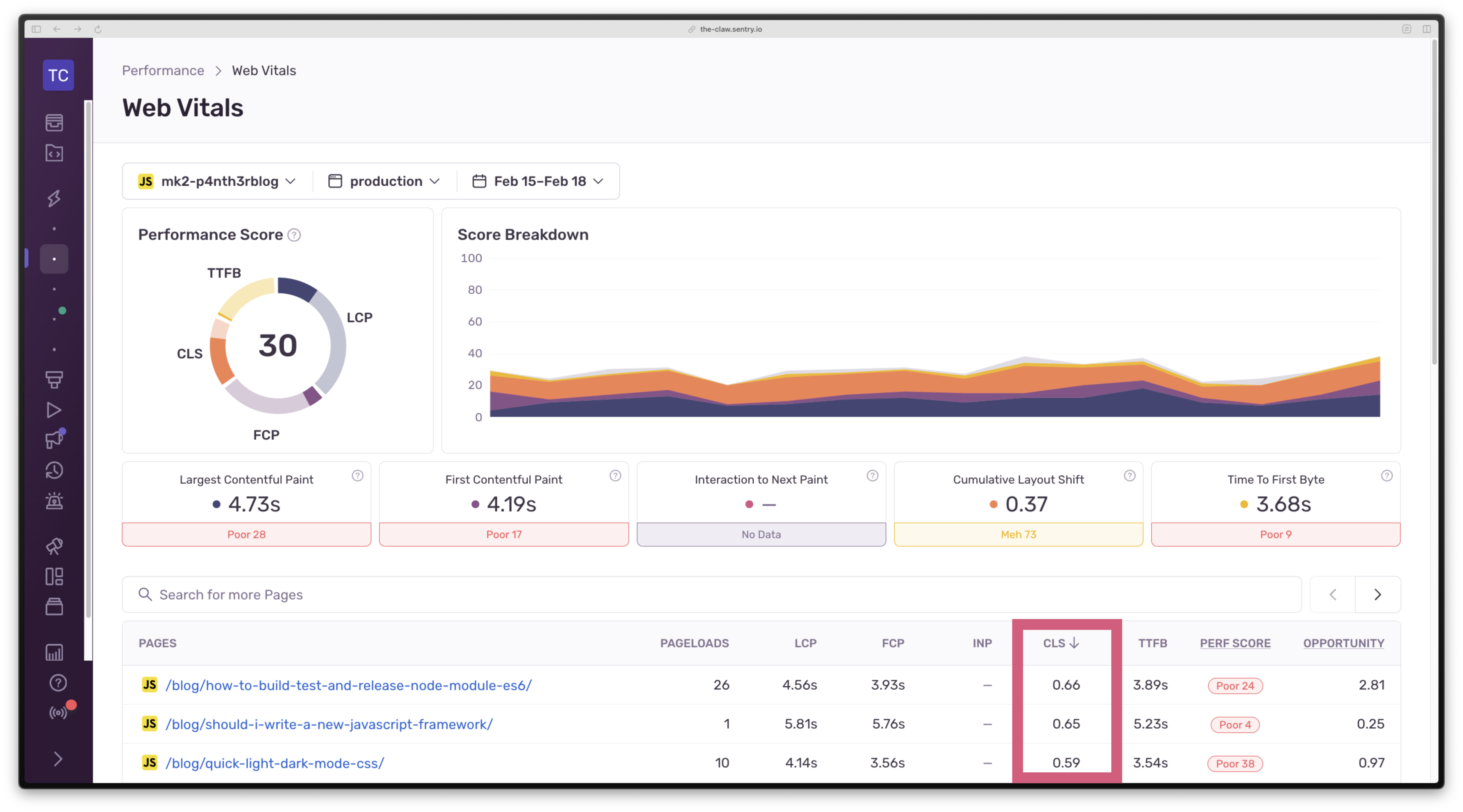
To discover your top sources of CLS, open up Sentry and navigate to Performance > Web Vitals. Below the top level performance score and score breakdown, you’ll see a table listing all of your page URLs. Click on the CLS header to sort by score descending to find the worst score. For my date range selected, the highest CLS was 0.66. This is the p75 score, which is the highest CLS value that 75% of users experienced for that page.
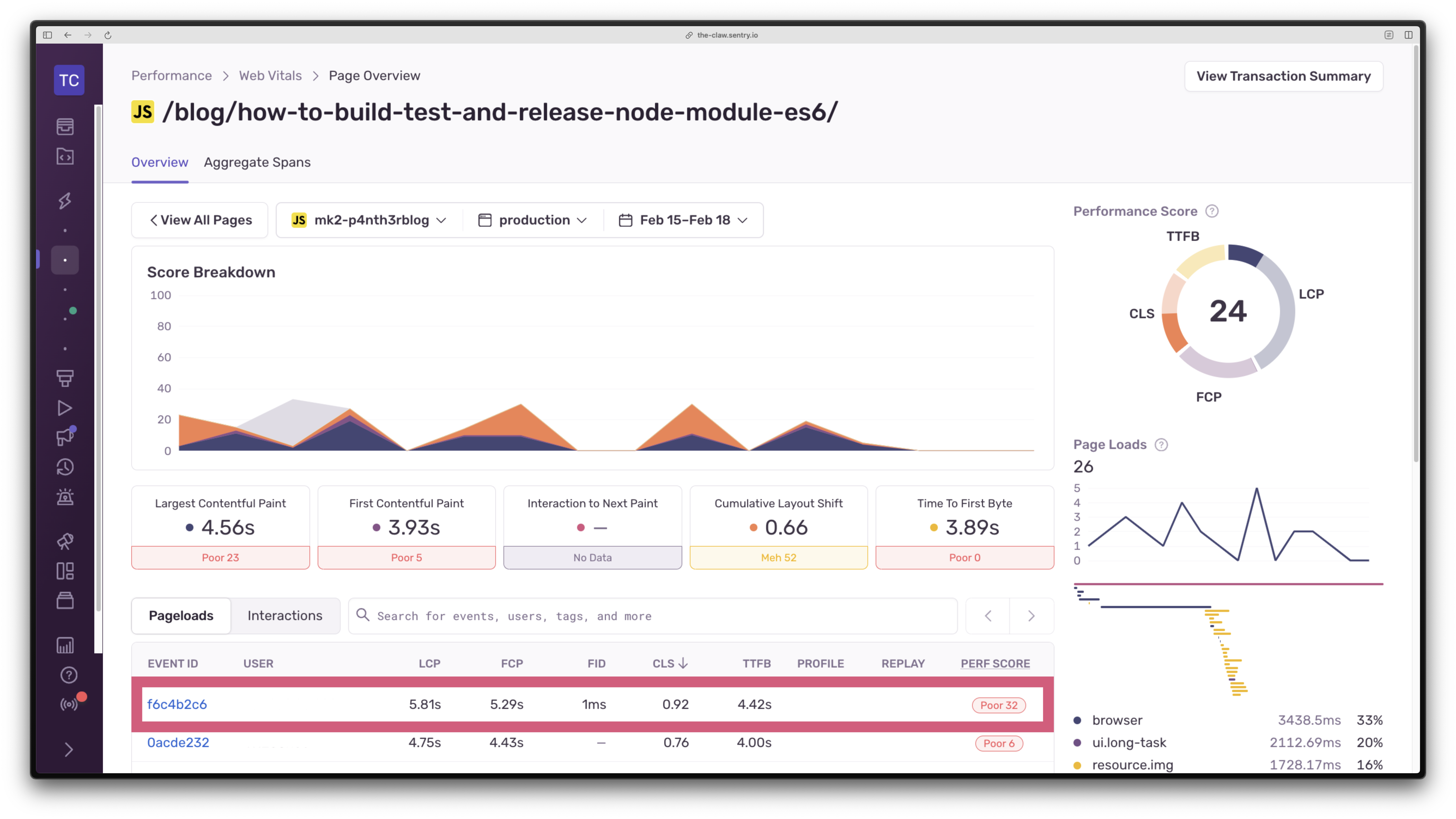
Click on the top item in the table. You’ll then see an overview of all sampled events for that particular page (not just p75). Sort the table of events by CLS descending again to find the highest score. I’m going to investigate an event that reported a CLS of 0.92.
On the event details page, scroll down and look for the Tag Details section, which should show a tag key of cls.source.1. Hover over it to see the full HTML element source captured.

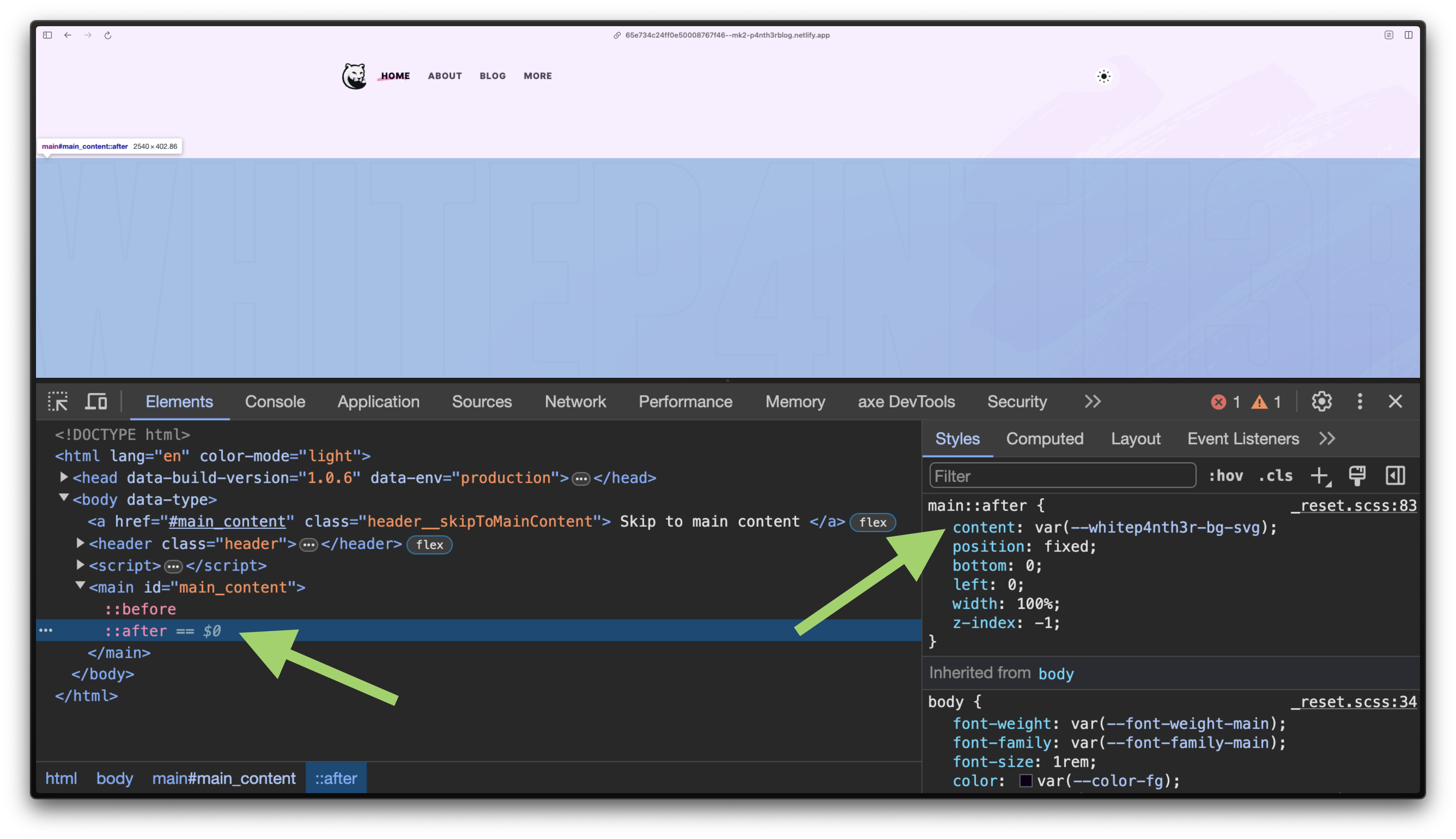
Now here’s where things got interesting. For this page on my site, the main source of CLS was coming from a CSS pseudo element attached to the main element, which contained an SVG that provided a little bit of design flair to the page. Here’s what I was sure of:
The SVG was added to the page via the CSS
contentproperty.It had a z-index of -1 with a fixed position.
It didn’t cause any foreground content to shift visually.
So what was the deal, here?
I broke the first rule of CLS: width and height attributes
Much to my disappointment, I discovered that I had not specified a width and height on the SVG that was added to the page via CSS. Shame on me. Fixing my mistake by adding a width and height on the SVG meant I had to make some changes to the CSS. And in hindsight, the changes actually led to more semantically correct CSS (more on that, later).
Here’s the diff of the changes and let’s explore why those changes were necessary.

main::after {
-   content: url("path-to.svg");
+   content: "";
+   background-image: url("path-to.svg");
+   background-repeat: no-repeat;
+   background-size: cover;
+   height: 0;
+   padding-bottom: calc(100% * 201 / 1280); /* image aspect ratio */
    position: fixed;
    bottom: 0;
    left: 0;
    width: 100%;
    z-index: -1;
  }
Why I chose a pseudo element
Pseudo-element selectors allow you to use CSS to style a specific part of a DOM element, such as the box that is drawn before or after an element. The initial value for the content property of the ::before and ::after pseudo elements for each DOM element is normal, which computes to none. This prevents the DOM from drawing an excess number of boxes that might never get used. You can read more in the official W3C spec for the content property, but it’s a difficult read.
Given this SVG was a design detail and not important in the flow of page content, I chose a pseudo element to display it to document that hierarchy in the code. Originally, the SVG was added to the page via the content property of the ::after pseudo element of the main HTML element.
The problem with styling SVGs in pseudo elemnets
Adding width and height attributes to the SVG without modifying the original CSS meant that the image didn’t span the full width of the page as intended. Instead, width: 100% in the CSS calculated the SVG width as 100% of its given width attribute size (1280px).

<svg viewBox="0 0 1280 201" width="1280" height="201" role="img"   xmlns="http://www.w3.org/2000/svg">
    <!-- SVG paths here -->
</svg>
In order to stretch an SVG to 100% of a container width using the width property in CSS, you need to be able to target the SVG element in CSS directly. Given the SVG was added via the content property of a pseudo element, this wasn’t possible: objects inserted using the content property are known as replaced elements, which are actually outside the scope of CSS. Adding a relative width attribute value of 100% to the SVG itself wouldn’t have solved the CLS issue either — because the browser needs an absolute pixel value in order to calculate the space in which to draw it.
And this got me thinking, if the content property made this so difficult to achieve, there must have been an easier way to make it work. And here’s where I started thinking about the concept of semantic CSS.
A move to semantic CSS
The use of the content property contradicted the intention of this background image. It wasn’t content, it was a background image. And so in the final implementation, I set the content property to an empty string so that the pseudo element could be drawn, and used the background-image properties to configure the SVG as a background image, as the design intended.
If you’re curious about the padding-bottom hack, this was necessary in order to scale the SVG proportionately when stretching it across the full width of the viewport given that auto-sizing isn’t an option for CSS background images. It wasn’t possible to set the width of the SVG as 100% and height as auto in order to achieve the desired result. Read more about scaling SVG in Amelia’s article on CSS Tricks.
This might have been trivial, but it matters
This was perhaps a trivial issue to investigate in such depth. However, CLS is one of those Core Web Vital scores that is prone to suffering from death by 1000 cuts. Sure, small bits of layout shift here and there are inevitable, and sometimes, acceptable. But the more you focus on solving the small problems when they arise, the less likely it is that you’ll suffer from the cumulative effect of performance issues. Which means you spend less time fixing, and more time building.
Originally posted on blog.sentry.io