I redesigned my website (again)
It’s been almost three years since I redesigned my website. The last major-redesign branch was merged into main on April 26 2023. I spent a good few months on the last redesign, and had lots of excellent design help from an Internet friend, Anatole. If you read my (not a) 2025 wrap up post, you’ll know that I’ve been trying to rebuild my website since April 2025. I’ve had this vision in my head for so long now that I don’t even know if it is good anymore, but it has been weighing me down and crowding my brain for almost a year because I just couldn’t make any progress.
I say rebuild and not redesign because I started to actually rebuild my website in Nordcraft, given it’s always beneficial to dogfood the products you are working on. However, my current website repo received its first commit in Jan 21 2022 and has received 986 commits since. It is home to a huge variety of content, it has been a personal labour of love of mine, and rebuilding it from the ground-up amidst all my other priorities felt extremely overwhelming.
Personal websites and the evolution of mine
At the start of the year, my friend Henry posted an incredible essay. In A Website To End All Websites: How to win the war for the soul of the internet and build the Web We Want, Henry urges us to build personal websites. More on this in a moment. But it was reading this article that inspired me to finally make my website what I wanted it to be in the way I wanted to.
Before the redesign, my website was extremely over-engineered and also messy in places, mostly due to how it’s been a playground for experimentation at work over the years. Whilst working at Contentful, Netlify and Sentry I frequently used my website to showcase features of those platforms, which often led to me building some very unnecessary things that no one used. Some of these features were cool, such as little banners based on the referring page powered by Netlify Edge Functions and the HTTP referrer header, but when I was laser-focussed on web performance at Sentry, I ripped all of those cool features out in the quest to get my Time to First Byte (TTFB) as low as possible. I even stopped using custom fonts.
After reading Henry’s essay, it dawned on me that my website was no longer as personal as it could be, given I had used it to do job stuff for so long. It had become a mish-mash of performance-hacking to the detriment of design and personality, a bloated wasteland of unvisited URLS such as the “blog posts filtered by topics” pages thanks to a GraphQL trick I wrote about at Contentful, a useless events page that merged my Twitch schedule and conference event entries from a CMS and localised the time for visitors using a Netlify Edge Function that got no traffic whatsoever, and it contained a very corporate article search powered by a post-build script that sent JSON to Algolia that no one ever used except me. And when I talk about the website being over-engineered, boy was it over-engineered. The only instances of hard-coded strings existed as page titles; every other bit of text came from the CMS. This constrained my creativity, especially when it came to the home page.
All this is to say that my website didn’t feel personal anymore. And so, this was the main goal of the redesign: to reclaim my personality on my own domain; to free my online home from the shackles of employment-based responsibility; to make something that was mine. Plus, the previous design was intended to be a marketing funnel for my Twitch channel (that’s literally the brief I gave Anatole) given that is what I was focussed on growing at the time. It sounds ridiculous now I type it out loud, but it made sense at the time. A lot of people discovered my website organically through links to my blog posts, and I wanted to make sure they knew I did live coding on Twitch. And now that I’ve retired from Twitch, it seemed fitting to evolve my website into the next thing.
In a true moment of clarity, thanks to Henry, I chose not to rebuild my website, but to redesign it; the tech stack is still Eleventy, Contentful and Netlify. I did it in a week. I lost sleep, I dreamt about coding, I bugged my friends for their thoughts and opinions and I couldn’t think about anything else. But I did it. (I also did it without a designer, which feels like a big deal for me. Maybe my years of experience are starting to pay off.)
As promised, I’d like to share some of the fun things I created in the redesign, and links to all the good articles that helped.
I started with a vibe
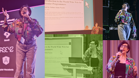
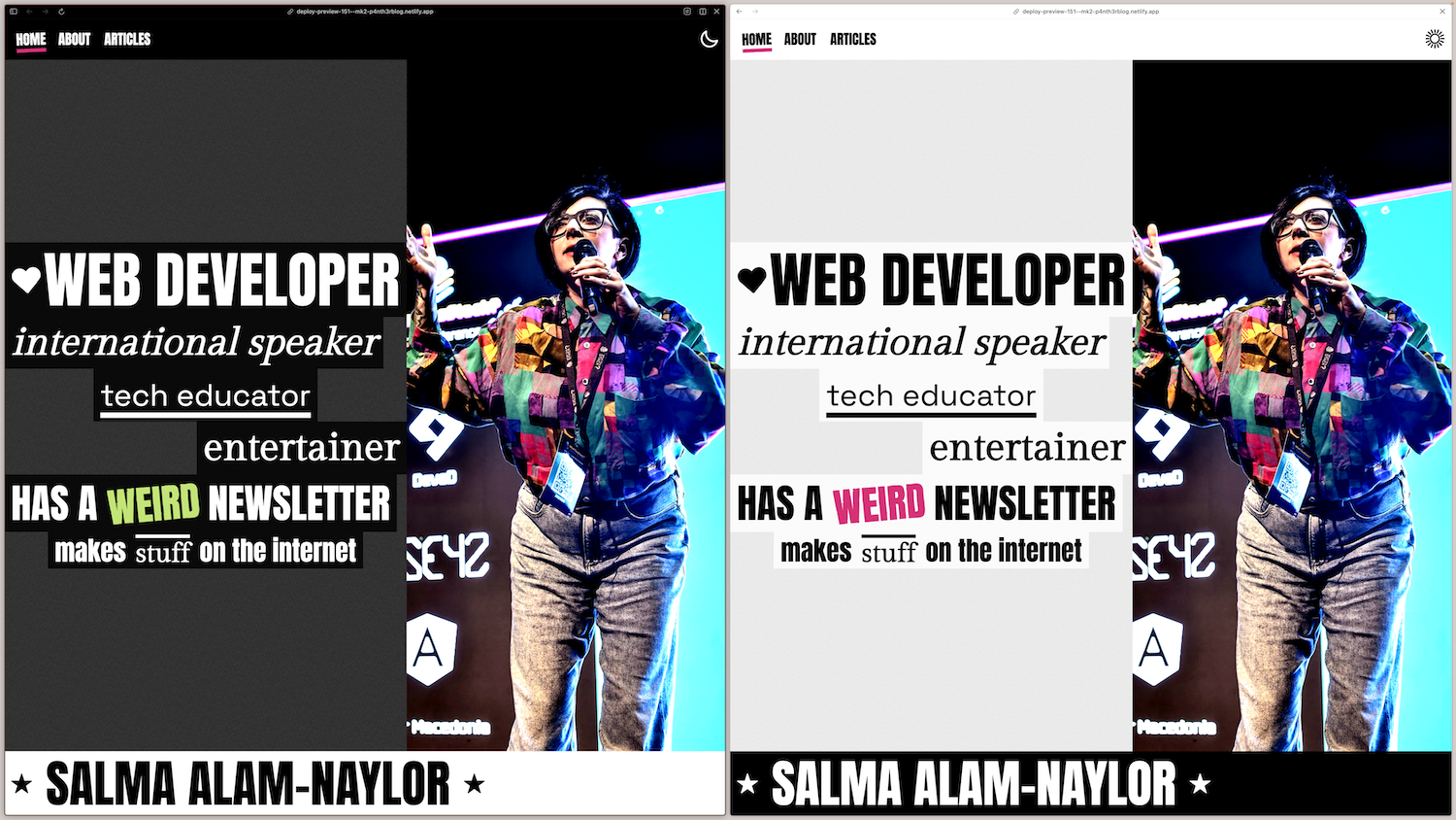
I started this redesign with a vibe based around my current Internet profile picture, which is a photo of me taken whilst speaking on stage at the What The Stack conference in Macedonia in September 2025. The talk I gave was set in 1995, and I was wearing a very excellent vintage shirt from the ‘90s to match the vibe. (Click here to watch the recording.)
The Shirt is at the heart of what this website redesign became.
The only solid plans I had for the design was to simplify the colour palette and use only #000 and #fff, the pink used on my previous design, and a complementary green. I was going for a kind of early 2000s punk/emo gig or music journalism vibe, with big bold lines, contrasting and seemingly chaotic fonts, and grunge-inspired textures.
For the grunge-inspired stuff, I used three little design details.
Distorted text using SVG filters
You’ll notice that some of the text on the page you’re reading is slightly distorted. Check out the active “Articles” link in the header, for example. This little text distortion effect is created using an SVG filter, which uses feTurbulence and feDisplacementMap. I’m using just one filter across the site for “design consistency” (whatever that means), which lives in the footer, so I can access it on every page.

<svg width="0" height="0" class="svg__filter">
  <defs>
    <filter id="distort">
      <feTurbulence
	      type="turbulence"
	      result="noise"
	      numOctaves="1"
	      baseFrequency="0.01 0.01"></feTurbulence>
      <feDisplacementMap
        in="SourceGraphic"
        in2="noise"
        scale="6"
        xChannelSelector="R"
        yChannelSelector="R"></feDisplacementMap>
    </filter>
  </defs>
</svg>
To apply the SVG filter to an element using CSS, you can use the filter property. For example, here’s how I add the filter to the active link in the header. Notice how the id attribute given to the SVG matches the value of the url value.

[data-active="blog"] {
  filter: url(#distort);
}
For a more in-depth read about distorting text with SVG, I recommend reading this article by Henry Desroches.
High-contrast and halftone images
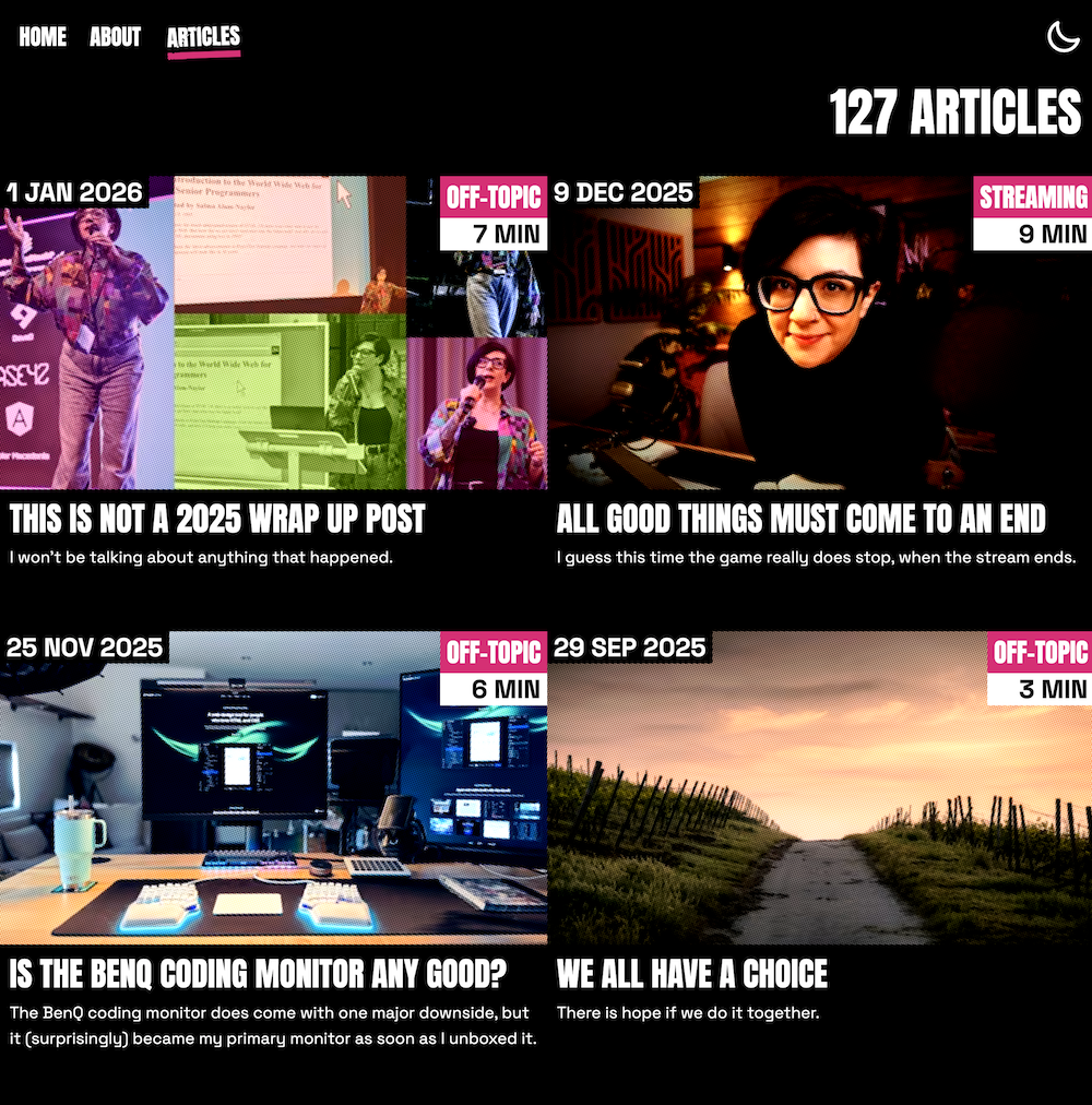
In order to maintain the grunge-inspired feel across the site, I wanted to stylise the images. I thought about getting rid of most of the images, for example on the cards on the list of articles, but the site needed some real-life colour, so I kept them in. An interesting Internet search led me to a very detailed article by Lean Rada on Creating a halftone effect with CSS.
Using this article as inspiration, I created my own halftone effect by creating an oversized pseudo element, and paired this with a CSS contrast filter and mix-blend-mode: hard-light to make the images really pop.
I built this as a mixin (yes, I’m still using Sass), and included it anywhere I needed it.

@mixin half_tone {
  overflow: hidden;
  filter: contrast(150%);

  &::before {
    content: "";
    top: -50%;
    left: -50%;
    right: -50%;
    bottom: -50%;
    position: absolute;
    transform: rotate(20deg);
    background: radial-gradient(circle at center, #000, #fff);
    background-size: 0.15em 0.15em;
  }

  * {
    mix-blend-mode: hard-light;
    object-fit: cover;
  }
}
Where I didn’t use the halftone effect on images such as the home page and about page, I used a CSS contrast filter set to 200%.
Textured backgrounds
Some of the solid colour backgrounds needed a bit of texture to either make things stand out a bit more in the foreground, like the hero section at the top of the home page, or blend more into the background, such as where you can see my photo and short bio on the blog article page. To generate the textures for these backgrounds, I used a Background Texture Maker by Alan Smith that generates CSS that uses a base64 encoded SVG to create a repeating background image. It also, coincidentally, uses SVG filters. This is the CSS I'm using for the background texture on the hero on the home page.

.hero__cloud__underlay {
  background-size: 150px 150px;
  background-repeat: repeat;
  background-image: url("data:image/svg+xml,%3Csvg viewBox='0 0 150 150' xmlns='http://www.w3.org/2000/svg'%3E %3Cfilter id='noiseFilter'%3E %3CfeTurbulence type='fractalNoise' baseFrequency='3' numOctaves='2' result='noise' /%3E %3CfeColorMatrix type='saturate' values='0' result='grayscale' /%3E %3CfeComponentTransfer%3E %3CfeFuncA in='grayscale' type='linear' slope='0.4' result='updated' /%3E %3C/feComponentTransfer%3E %3CfeMerge%3E %3CfeMergeNode in='noise' /%3E %3CfeMergeNode in='updated' /%3E %3C/feMerge%3E %3C/filter%3E %3Crect width='100%25' height='100%25' opacity='0.46' filter='url(%23noiseFilter)'/%3E %3C/svg%3E");
}
What I also love about this background texture is that it works in both light and dark mode without needing to provide different background-image values based on the theme.
The vibes were received
When I showed a deploy preview to my friends, they understood the vibe; they got the memo. And the fact that I was able to communicate the vibe so clearly made me feel very accomplished indeed.
“I get mid-late 2000s punk flyer”
“Feels like a piece of London rock venue promotional material from ~2010 (complimentary)”
“This site makes me think of cheap rock punk gigs I used to go to when I was younger and I'm absolutely all for it”
Scroll trigger animations
On the home page I needed a bit of something something on scroll, and so I thought on larger screens it would be fun to horizontally scroll my name as you scroll down the page. I thought I could use CSS scroll-timeline for this, but I couldn’t get it to work very well. I either gave up too soon or this is not what scroll-timeline is for, so I opted to use the ScrollTrigger plugin from GSAP. I’ve never used GSAP before, but it’s been on my list to try since around 2015; it was about time.
The GSAP API is really intuitive, and it gives really smooth results. This is the code for the scrolling name that triggers if the prefers-reduced-motion preference is not set to reduce.

gsap.to(".hero__name", {
  x: "100%",
  ease: "none",
  scrollTrigger: {
    trigger: "html",
    start: "top top",
    end: "bottom top",
    scrub: true,
  },
});
I also had a little fun with moving and scaling the image of me at the time same, which also uses GSAP.

gsap.to(".hero__img", {
  scale: 1.2,
  y: "-20%",
  ease: "none",
  scrollTrigger: {
    trigger: "html",
    start: "top top",
    end: "bottom top",
    scrub: true,
  },
});
There are a couple of other little scroll trigger animations powered by GSAP dotted around the site as well.
View transitions
I started writing an article about cross-document view transitions a few months ago, and haven’t had time to finish it. Whilst researching for the article, I went extremely overboard with the page transitions on the previous design (regular readers might have noticed), so I toned it down in the redesign, whilst adding some stand-out details.
Default page transitions
This block of CSS adds a fade transition when navigating between pages. I tried providing a different animation-duration for prefers-reduced-motion but I really didn’t know whether the fade should be quicker or slower, so I only apply the view transitions when there is no-preference.

@media (prefers-reduced-motion: no-preference) {
  @view-transition {
    navigation: auto;
  }

  ::view-transition-group(root) {
    animation-duration: 0.4s;
  }
}
Hero image and name transitions
What’s nice about view transitions is that when they’re enabled, you can add a view-transition-name property to elements via CSS, and if the browser can match elements with the same property names across different pages, it will transition them automatically without any further configuration. I use this technique to move my name and image between the home and about pages.
Rather than messing around with any custom animations (which you can do, but I’ve found it to be a very tiresome process that doesn't always produce the same results every time), I used the default view transitions behaviour by just adding a view-transition-name to both the image and name banner to transition them between the pages.
Try navigating between the home page and about page to see how powerful this little block of code is. This is all I’m using in the way of view transitions for the hero name and hero image, coupled with the view transition activation code above.

/* home page */
.home__hero__name {
  view-transition-name: hero-name;
}

.home__hero__img {
  view-transition-name: hero-img;
}

/* about page */
.about__hero__name {
  view-transition-name: hero-name;
}

.about__hero__img {
  view-transition-name: hero-img;
}
Article title transitions
I also use the default view transition behaviour on article headings, so when you click on an article card, the article title transitions to the top of the page on the article layout. Given each view transition needs a unique name, this needed to be done inline on the element itself. Luckily, each of my articles coming from the CMS has a unique ID, so I used that to create a unique view-transition-name.

<!-- on the card component -->
<h2 class="card__title"
  style="view-transition-name: heading-${item.sys.id}">${heading}</h2>

<!-- on the article layout -->
<h1 class="post__h1"
  style="view-transition-name: heading-${post.sys.id}">${post.title}</h1>
The article layout
When I spoke at Front End North in July 2025, I was very inspired by a talk given by the wonderful Nils Binder titled Unwrapping Web Design, in which he challenged the audience to stop making the same old boring website designs we’ve been making since 2010 and think a little more creatively about page layouts. In the talk, Nils showcased some interesting layouts that used irregular grid column widths, and generally just got a little bit creative with the whole concept of a layout.
I have attempted to channel Nils’ advice in the new article layout on larger screens especially, which uses the following grid layout to try and break out of the two or three column standard.

.article {
  gap: 2rem;
  display: grid;
  grid-template-columns: 1fr;
  grid-template-areas:
    "title"
    "aside"
    "content"
    "author"
    "bsky";
  align-items: flex-start;
  flex-direction: column;

  @media screen and (min-width: utils.$post_breakpoint_md) {
    gap: 1rem;
    display: grid;
    grid-auto-columns: auto;
    grid-template-rows: auto 1fr auto;
    grid-template-areas:
      "title title author"
      "aside content author"
      "bsky bsky bsky";
    grid-template-columns: 2fr 6fr 2fr;
  }

  @media screen and (min-width: utils.$post_breakpoint_lg) {
    gap: 3rem;
    grid-template-areas:
      "bsky title title author"
      "bsky aside content author";
    grid-template-columns: 1fr 2fr 6fr 2fr;
  }

  @media screen and (min-width: utils.$post_breakpoint_xl) {
    grid-template-columns: 1fr 1fr 7fr 2fr;
  }
}
Showing Bluesky replies on blog posts
As well as showing Bluesky likes on articles, which I wrote about in 2024, I now show replies to that post as well. This was a bigger undertaking than I anticipated and involved much recursion to render embeds within embeds within embeds, and replies to replies to replies.
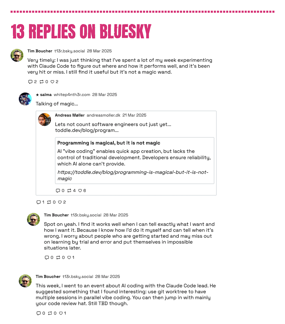
The code is a mess, but it was fun. I will do a full write-up of how I achieved it in due course, but the main takeaways were this:
To have some level of moderation over the replies shown, I’m using an authenticated endpoint to fetch the replies as myself. This means I can hide replies on Bluesky that I don’t want to show on my articles.
I’m fetching the replies client-side via a serverless function so they are always up to date. However, I am not sure how scaleable this will be. I managed to rate limit myself once during development when I had too many localhost tabs open, so I have a feeling this might happen on high-traffic articles. If this is noticeable, I’ll probably end up writing a daily cron job to save the replies to JSON in my website repo, which I’ll fetch from the client. Alternatively I could fetch the replies at build time, but that also means I’ll have to rebuild my website regularly (probably daily) in order for the replies to stay as up to date as possible. This also means that if I ever need to hide replies, I’ll need to run the cron job immediately. I don’t think I want this level of administration in my life.
As a result of using a serverless function to fetch the replies data, there is no way to reliably cache an authentication token unless I use a separate service to store it. This means I am requesting an authentication token on every request for the replies. I don’t like this and this is why I am considering using a cron job to fetch the replies and store them at regular intervals.
The above two bullet points are why I am delaying the full write-up of how I show the replies on my articles, because I want to find the best solution.
Overall, I love seeing the Bluesky replies under an article. There's something really wholesome about it.
Spotlighting my weird newsletter
In the previous design, I included a link to my newsletter on the home page and next to blog posts. However, this was just a link, and didn’t look very official. Yes, it’s supposed to be purposefully weird, but I guess that only goes so far.
My newsletter is powered by Buttondown, and they provide you with a block of HTML with a simple sign-up form that you can drop in anywhere on your website and style to your heart’s content. Now, interested readers can subscribe to my newsletter from any page directly. I also tell you a little bit more about what you’ll get with the newsletter. Scroll down and try it out, I dare you.
It’s done
Now that I’ve released the redesign, I’m looking forward to more sleep and more relaxed shoulders. Fixing up this website in just a week whilst doing a job and being a parent and going to yoga and practising drums and doing other things has been a wild ride, and I’m actually really happy with it. There are also some other things I’d like to add to the website, such as newsletter archives and some other little details, but that can wait.
If you’re now feeling motivated to redesign your website or make your first website(!), check out this list of human-made and human-curated personal sites for inspiration.
The world is your oyster. And so is The Web.
