A responsive striped CSS gradient inspired by 80s VHS tapes
I'm really into retro-tech at the moment. And whilst I still haven't gotten round to playing with my new Commodore 64 Emulator, I have been collecting images of old VHS tapes that inspired the design of my most recent website project. Just look at the beauty that is the Sony T-120!
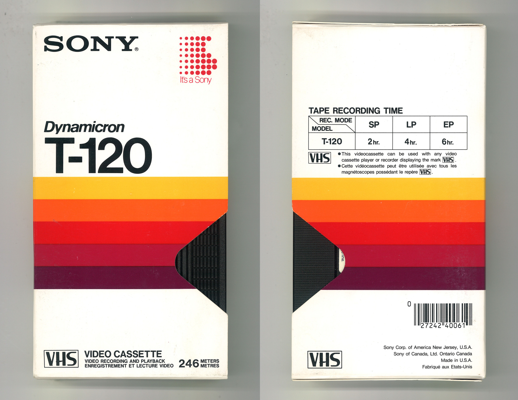
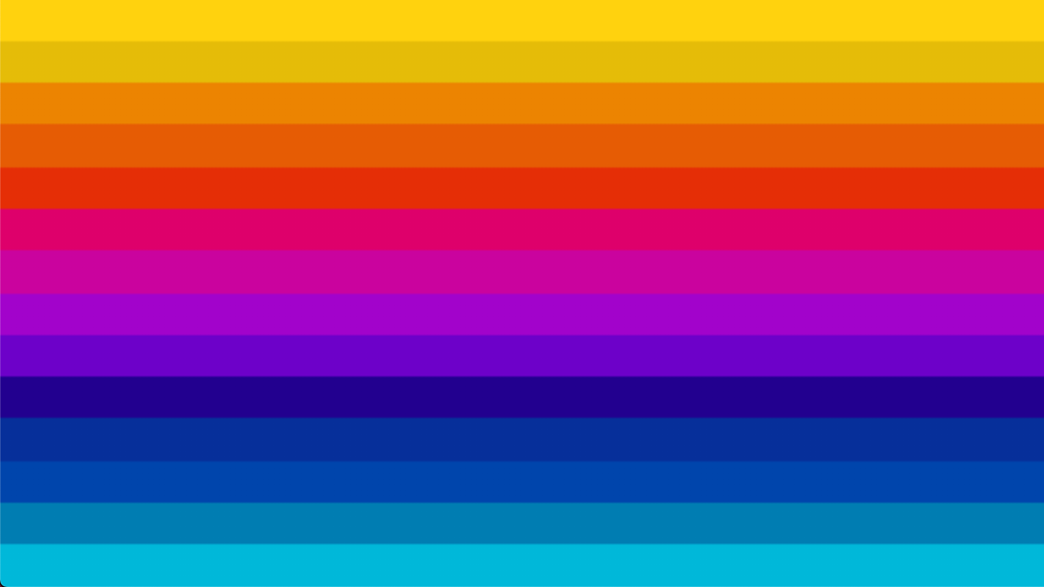
Inspired by the Sony T-120 and other similar retro VHS designs by Christopher Kirk-Nielsen (four of which are hanging proudly in my office!), I created a moodboard and sent it on to my good friend, designer and live streamer aaoa_. He created this beautiful retro striped pattern for me, and my challenge was to build this in pure CSS without using a background image.
How it looks
How it works
Hard stops
The pattern is created using a CSS linear-gradient (using the direction "to bottom") with what are known as "hard stops". A hard stop is created by defining the end of one colour in the same place as the start of the next colour.
vh units
The biggest design challenge was making sure the full pattern of 14 colours was visible at any viewport size, and didn't scroll with the content. The key was to use vh unit to determine the size of each colour stop. The vh unit is a relative unit, and describes a percentage of the viewport height. 1vh is 1% of the viewport height, 50vh is 50% of the viewport height and so on. Using vh is what enables the full gradient pattern to respond to the height of the viewport. Read more about different units in CSS on MDN.
Here's a two-colour hard stop gradient as an example, in which we're using the vh unit to specify the size of each colour stop.

.twoColorStop {
  min-height: 100vh;
  background: linear-gradient(
    to bottom,
    red 0 50vh,
    yellow 50vh 100vh
  );
}
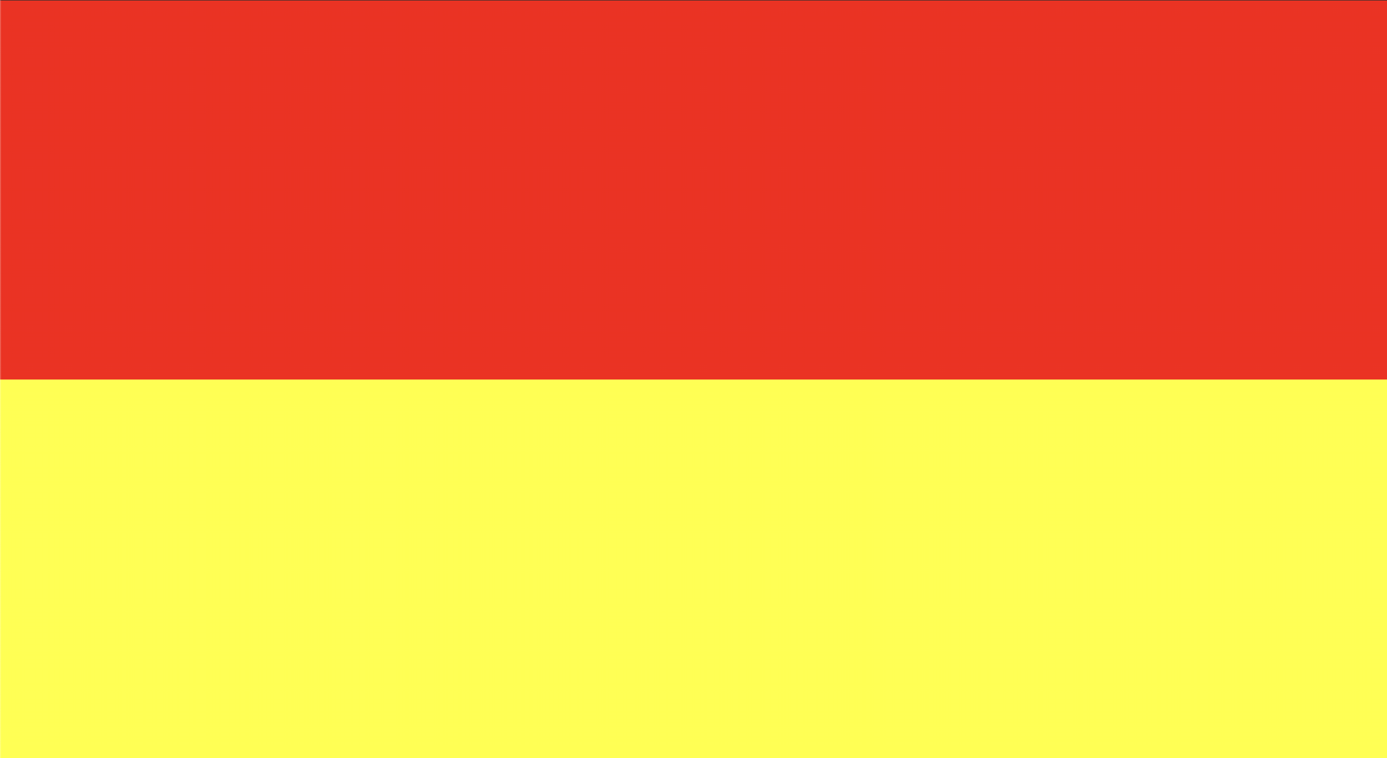
Here's the result.
Notice that:
the first colour (red) ends at 50vh
the second colour (yellow) starts at 50vh
Where red stops, yellow begins, creating a hard stop. There are ways you can write the CSS above in a shorthand form, but I've written it out verbosely to demonstrate the concept more clearly.
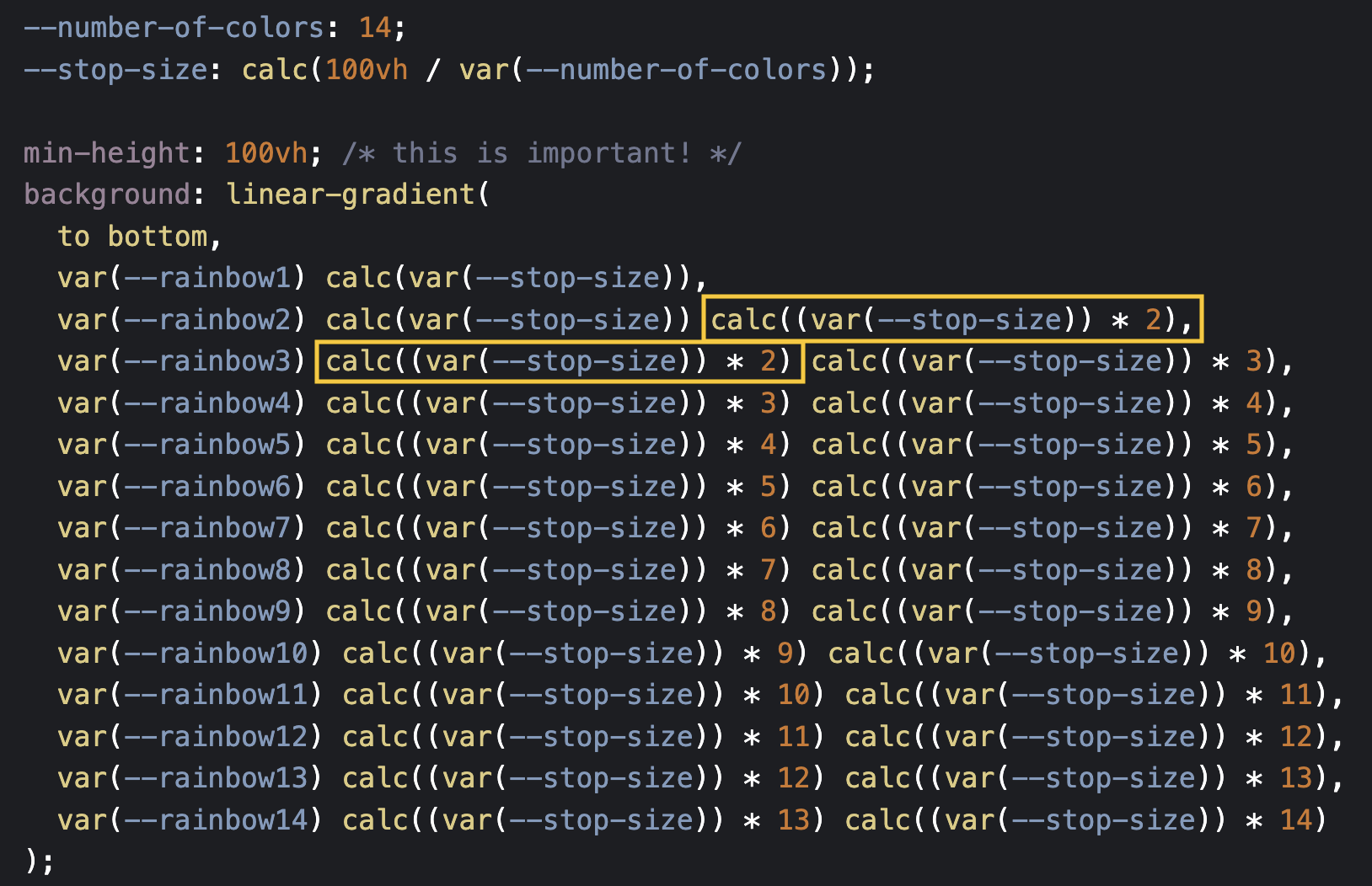
The only differences between this example and the full example is that I'm using 14 colours instead of two colours, and I'm using CSS custom properties and CSS calc() to avoid writing out 14 lines of magic numbers. Notice though, that where one colour ends, another colour begins at the same vh value.
Today I learned!
Oliver Turner turned up on Mastodon with some solid advice that I'd not discovered before!
One interesting property of linear gradients that can make generating stripes less verbose is that any number less than the previous stop works to create a hard border, so instead of needing to track the previous value you can use 0.
Here's the demo. Thanks, Oliver!
And finally, to allow the page content to scroll whilst the background pattern stays fixed in place in the viewport, it's wrapped in a vertically-scrollable element inside the container providing the background gradient pattern. Set height: 100vh on this element to prevent the content increasing the height of the last colour in the gradient. Experiment in the CodePen above and see what happens if you remove the height property on the .wrapper class!
See what you can make with this CodePen. Take it, fork it, copy and paste it... Take this linear gradient wherever your heart desires!

