Debug your CSS layouts with this one simple trick
If you've been watching my Twitch streams lately, you'll know I'm currently rebuilding, redesigning and reimagining the full whitep4nth3r.com experience. Whilst building the new blog page layout, I came across a classic CSS conundrum.
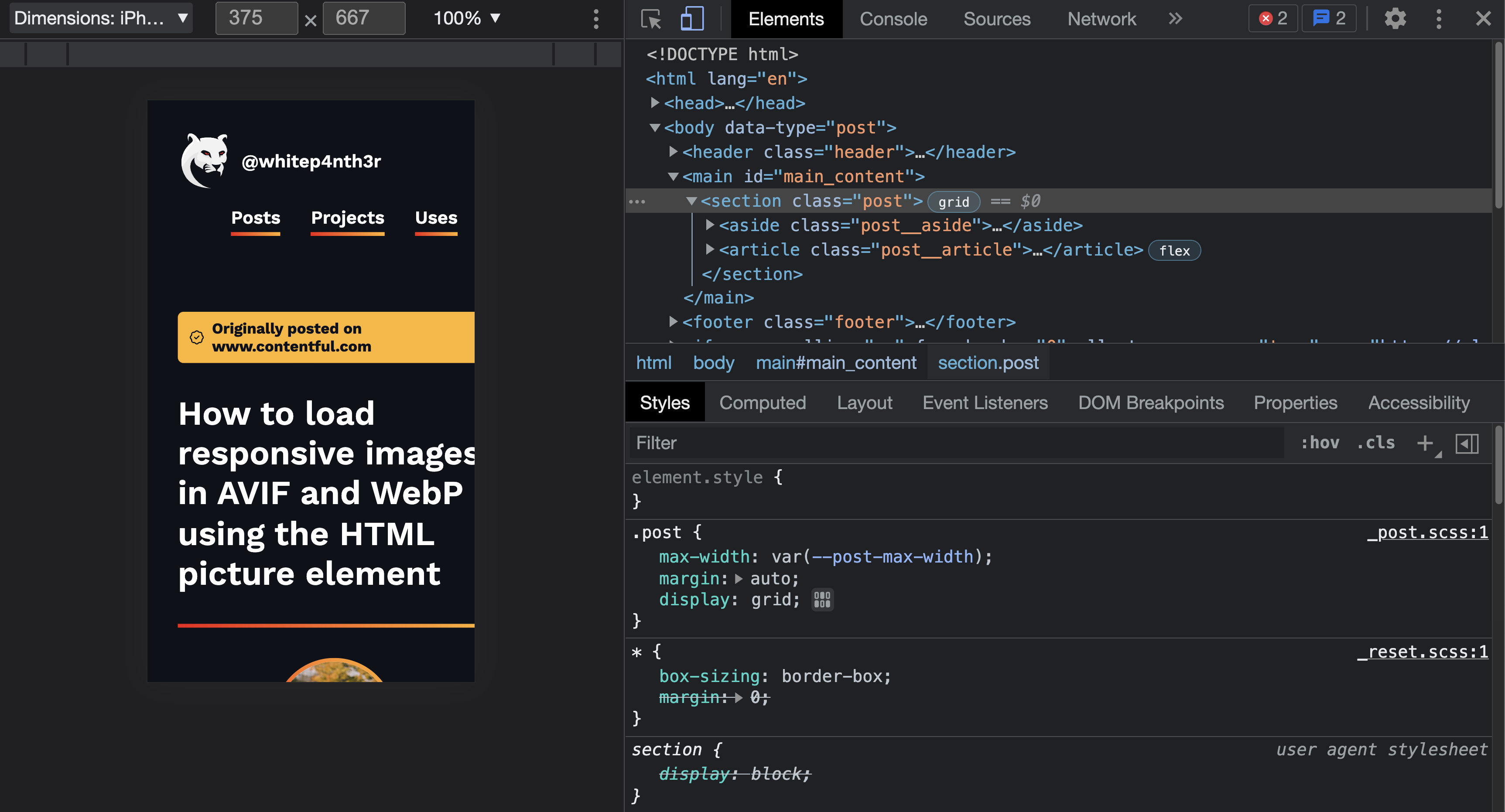
On smaller device sizes, the content was spilling out of the viewport, causing a horizontal scroll, like this:

Now, I've felt this pain many, many times. But there's no need to lose sleep anymore. Here's how I debug my page layouts to find out what's up — with just one line of CSS.
This line of CSS will save you
Add the following code snippet to your CSS file or your browser dev tools.

* {
  outline: 1px solid red;
}
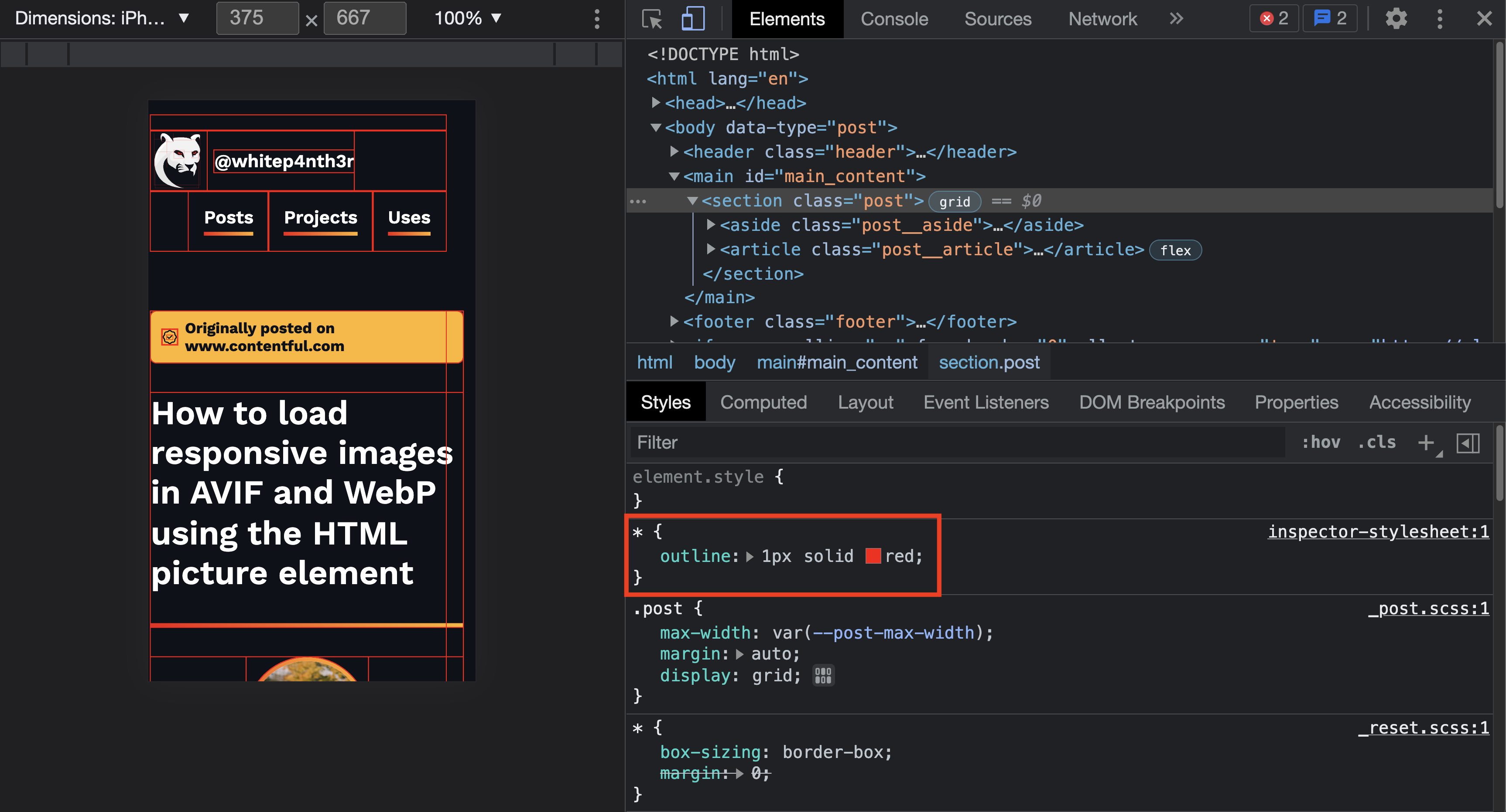
This line of CSS adds a red outline (or whatever colour you choose) to every single element (*) on your page. By scrolling through the content, you should be able to see which elements are spilling out of your viewport. Now you can experiment with removing or adding CSS properties in dev tools as needed.

A quick note: I would always recommend debugging CSS using your browser dev tools rather than going back and forth between updating CSS in your IDE and refreshing your browser. It's much more time-efficient this way!
In my case, I was able to discover that the section tag with class="post" was causing the issue. Notice — in the image above — how the red outlines showed the content spilling out of that element! (The fix isn't important, but if you're curious, I needed to remove display: grid from the post class at that viewport width.)
Why outline and not border?
The reason why we use outline rather than border is all down to how the CSS box model works. Outline widths do not affect the layout of elements according to your CSS box-sizing rules — but border widths might!
If some elements are set to use box-sizing: border-box, and some elements are using the browser default of box-sizing: content-box, then the layout of those elements will respond differently to different border widths.
border-boxincludes border widths in the calculated width of the element,content-boxadds border widths to the calculated element width.
For a more in-depth look at the CSS box model (and how it will change your life!), check out this talk I did at CodeLand Conf 2021.